When looking for a lightweight Bootstrap alternative, developers need to strike the right balance between simplicity and functionality. Each option has its strengths: performance in Skeleton and Base, ease of use in Bulma and UIkit, or specific design philosophies in Material Design or Flexbox. Our blog post reviews 10 frameworks that fit different project needs, tech skills, and requirements.
In web development, there are some front-end frameworks that allow programmers to create useful and innovative web solutions much easier and faster. Bootstrap is one of them. It is an open-source front-end framework developed by designers and software engineers at Twitter. In general, Bootstrap comprises HTML/CSS elements (i.e., typography, buttons, forms, navigation, and other user interface components) and JavaScript extensions. It also supports HTML5, CSS2, and CSS3. So, basically, Bootstrap is a set of tools for creating responsive and mobile-first projects on the web.
Here is a list of reasons why Bootstrap is so popular among developers:
- easy to get started
- superb grid system
- rapid development process with numerous templates available
- extended base styling package with most HTML elements (typography, buttons, icons, forms, images, tables, and much more)
- bundled JavaScript plugins
- easy integration with other frameworks and platforms
- helpful and extensive documentation
But when you want to create something simple and straightforward, you don’t need all CSS and JavaScript features and extensions offered by Bootstrap. What you need is something less complex. If you are looking for a framework like that – here’s a list of 10 Bootstrap alternatives.
Top 10 Alternatives to Bootstrap
Skeleton is a CSS framework that is one of the best alternatives to Bootstrap. It’s excellent for some small projects when there is no need to use all Bootstrap functions. Skeleton defines itself as a “dead simple, responsive boilerplate”. In particular, it has its well-structured grid system and some basic styles for common HTML elements, such as buttons, lists, tables, and forms. This framework also offers CSS best practices, code limited to around 400 lines with comments, 12-column fluid grid, and easily customizable base styles.
Since it is not a UI framework, it provides only basic UI elements. However, Skeleton can be easily adjusted to any style or design. You also get a responsive design and a mobile-first approach if you use it. Although Skeleton has some limitations, it’s simple and fast to start, which is often enough for a good jump-off.
Base
Base is another framework like Bootstrap. It contains the most essential things needed to create a website – the grid and the basic styling of HTML elements. Base won’t offer you fancy UI components since it provides only those elements which come with HTML by default. But it follows a mobile-first approach and ensures a great feel and look of an app on different devices, including smartphones.
The downside is that Base doesn’t include JavaScript. But it is synchronized with both modern and old browsers such as IE8+. In general, Base offers a solid foundation for building responsive and user-friendly web solutions.
Concise CSS
Concise CSS is also one of the most lightweight alternatives to Bootstrap. It supports Vanilla CSS and SASS while maintaining LESS and Stylus versions (although they are currently unsupported). Despite the fact that this front-end framework is similar to Bootstrap, it is leaner, bloat-free, and easier-to-use.
Concise CSS is mobile-friendly and designed for creating responsive websites and applications. It also offers a number of add-ons called bonus components. Another benefit is that Concise CSS can be easily updated since you just need to replace the core files, while your custom styles will stay untouched. This framework is considered good for beginners because it has easily readable documentation and light utilities package.
Cardinal CSS
In particular, it includes a simple and flexible responsive grid system, scalable typography, styles for common UI objects (buttons, tables, and more), and typical layout modules. It also implies the usage of a rem unit to resize the typography and layout of an application at different breakpoints. Cardinal CSS serves as a base for the project, leaving such things as design and creativity up to developers.
Furtive
Furtive is a mobile-friendly alternative to Bootstrap. This CSS framework is called a micro-framework since it focuses on creating small web applications and websites. It includes a responsive grid, buttons, tables, colors, forms, media objects, and other design elements. Furtive is capable of using such forefront web standards as Flexbox, SVGs, and limited vendor prefixing. It also uses a rem unit for sizing elements.
Furtive positions itself as a “perfect starting point to get your project up and running”. The biggest disadvantage of this framework is that it doesn’t support older browsers.
Pure
Developed by Yahoo, Pure is a framework that consists of small and responsive CSS modules. This alternative to Bootstrap is so tiny that all its module clocks (minified, gzipped, and put together) weigh even less than 4.0KB. Pure has a responsive grid and its elements can be customized according to different user needs.

Besides, Pure is built on Normalize.css which makes it consistent and compatible with different web browsers. Pure’s CSS modules can be used for creating web forms, responsive grids, buttons, tables, menus, and many more. In addition, Pure offers styling and layout for native HTML elements and common UI components. It is fully responsive, so users will get a great look and feel no matter what device they use. Pure also provides its users with helpful and extensive documentation.
Milligram

Milligram is one of the most lightweight Bootstrap alternatives. It weighs only 2KB gzipped. Milligram doesn’t serve as a UI framework, it rather offers a minimal setup of styles along with a clean and fast start. This lightweight framework includes such basic elements as buttons, lists, grids, tables, blockquotes, typography, codes, and utilities. It is designed to make performance and productivity better while using fewer properties to reset.
Milligram works with modern UIs and officially supports new versions of Chrome, Opera, Firefox, IE, and Safari. On top of this, it provides an informative and easily understandable guide for beginners.
Stringbean
StringBean is also one of the lightweight responsive CSS frameworks like Bootstrap aimed at simplifying front-end development. While most frameworks use a 12-point system, StringBean offers a 24-point grid, which ensures great compatibility with high-resolution screens. This framework has six breakpoints instead of the traditional four, ranging from “x-small” to “mega-UHD”. It allows developers to create full-screen layouts that look good on both mobile phones and 4K monitors.
In addition, StringBean offers an entire package of the standard HTML elements, including typography, navigation bar, buttons and button variants, info wheels, labels, progress bars, forms, tables, rows, and cells.
Toast
Toast is an extremely simple responsive front-end framework. It describes itself as an “insane, no-nonsense CSS grid”. Toast’s greatest benefit is the unprecedented control that it gives to users. This framework has a 12-column responsive grid, so you can use it to create both a one-column layout for a small screen and a 12-column layout having up to 960 pixels in width. Users have the right to choose the number of columns as well as their combinations. Besides, Toast’s flexible configurations allow users to adapt grid class names and the gutter. In general, Toast is all about being customizable, responsive, and easy-to-use.
Layers CSS
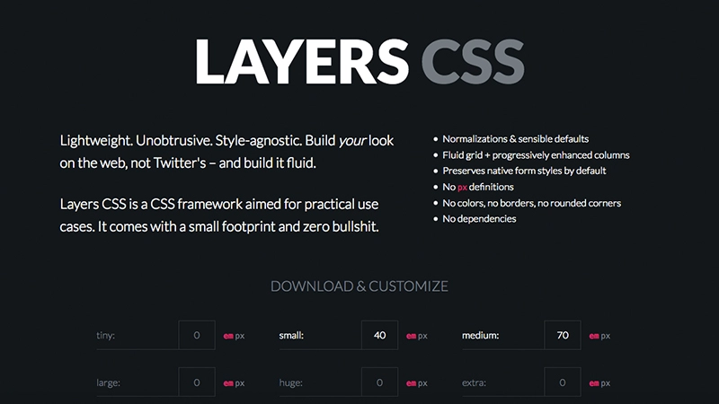
Layers is a lightweight, unobtrusive, and style-agnostic CSS framework. In general, it is not about design, it’s more about structure. This framework has inbuilt CSS normalization and sensible defaults, fluid grid, and layout tools. It also comes with native form styles for lists, tables, and tools. The features Layers CSS doesn’t offer include px definitions, colors, rounded corners, and dependencies.
Conclusions
In this article, we outlined the list of 10 lightweight Bootstrap alternatives. All of them are mobile-friendly, light, relatively simple, and easy-to-use. They have a lot of similar features and tools. But each framework puts the main focus on different utilities, instruments, and advantages. For those seeking an alternative to WordPress, some of these frameworks also provide robust options for building lightweight and customizable web solutions. So, you should define your priorities and requirements to decide which option to choose. Hopefully, we helped you to reach the right decision in searching the best Bootstrap alternative for your needs.